Between our work with our partners at Hopper and developing our finance journaling app Fey, Narative has had plenty to keep us busy in our studio’s less-than-a-year of existence.
But one thing that hadn’t been keeping us busy was our website at Narative.co — and it certainly did show. With a homepage consisting of two sentences and navigation that largely linked to outside sites like Medium and Twitter, it was on the user to do the work in understanding who we are and what we do, and we weren’t giving them much to work with.
While this served us well early on as enthusiastic referrals from our professional network kept us plenty busy, anyone unfamiliar with us would struggle to get a clear picture of the value we bring. That needed to change.
Our major goals in revamping our website were to:
Swiftly help prospective clients envision the potential of working with us
Display our approach hands-on in an interactive and memorable way
Take control of our content by moving articles from Medium to our site
All while presenting everything in a way that feels unique and representative of what we do at Narative. In this article, we’ll dive into the strategy, design and technology behind the new Narative.co and what it means for our company’s future.
Honing the message
There is a ton of talent out there ready to help businesses build and grow their products. While the companies we've built our careers and experience in are well-known, as a new independent studio, Narative itself lacks history and exposure.
But that doesn’t mean we can’t be the best pick for the partners we work with. The question we felt most necessary to answer: why would businesses seriously consider choosing us?
1. We build brands, websites and products
Before getting into what makes Narative unique, we want to immediately echo the needs that are top-of-mind for potential clients so that they know we’re speaking their language, even if we personally feel it undersells what we do. It can be tempting to lean into aspirational-yet-vague language about innovative change and digital experiences that make it seem like we can do anything and everything, but our clients don’t tend to think in those terms — neither should we. Once we establish this basic, easy-to-understand premise, we can begin layering the more unique elements on top.
2. Our background is in growing startups, not agencies
We actively avoid referring to ourselves as an “agency” both because it can set the wrong expectations, and because our team doesn’t have a typical agency background. The Narative team is made up of people with senior-level experience in building and marketing products at growing companies in-house. We approach each partnership with a mindset closer to that of an internal team than an external agency, digging deep into the needs of each company and their customers before we begin building anything.
3. We’re experts in the problems that growing companies face
Whether a business is just starting up, hitting its stride or expanding into an enterprise, there is one problem common to every stage of growth — there are always more opportunities worth seizing than resources on-hand to seize them. Having faced those challenges in the companies we’ve worked in before, we’ve learned how to apply focus and seize the right opportunities at every step of the journey. We work closely with our partners to help their companies reach their fullest potential.
The goal of the new Narative homepage would be to express and support these key messages as concisely as possible. We want to quickly establish mutual understanding and build the confidence necessary for them to either reach out to us about their next project, or continue exploring our site to learn more.
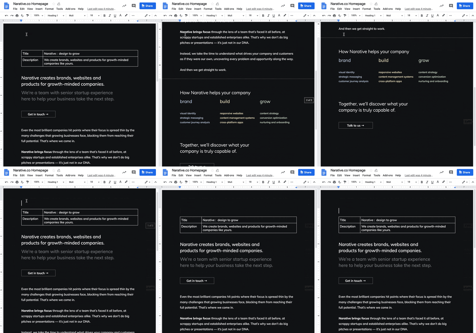
We chose to retain the two-sentence heading structure from the original homepage and roll it out across each page on the site, as it fits well with the conversational tone we’re going for and gives us the space to be both clear and creative.
Consistent with that, we chose to present most of copy on our homepage as a letter to the user, complete with punctuation and even entire paragraphs! It’s a bit funny to talk about full sentences as if they are some bold design decision, but look around the web and it’s easy to see how the pressure to cram in as many points possible has lead to an epidemic of pages that feel like collections of barely-connected bullet lists, leaving little space to inspire or explore.
It also makes it difficult for the reader to know which content is worth focusing on — and with focus playing a key role in our messaging, we knew it was important for us to not just say that it matters, but to show the value first-hand.
Designing for focus
In his seminal book on usability design Don’t Make Me Think, Steve Krug explains that “people tend to spend very little time reading most web pages. Instead, we scan them, looking for words and phrases that catch our eye. [...] On most pages, we’re really only interested in a fraction of what’s on the page. We’re just looking for the bits that match our interests or tasks at hand, and the rest of it is irrelevant.”
Users don’t tend to read web pages linearly from top-to-bottom; they rapidly scan the page looking for relevant information, and only once it’s spotted do they zero in on the details.
One reason for this may be that experience has taught users that most of the information on a page is, indeed, irrelevant.
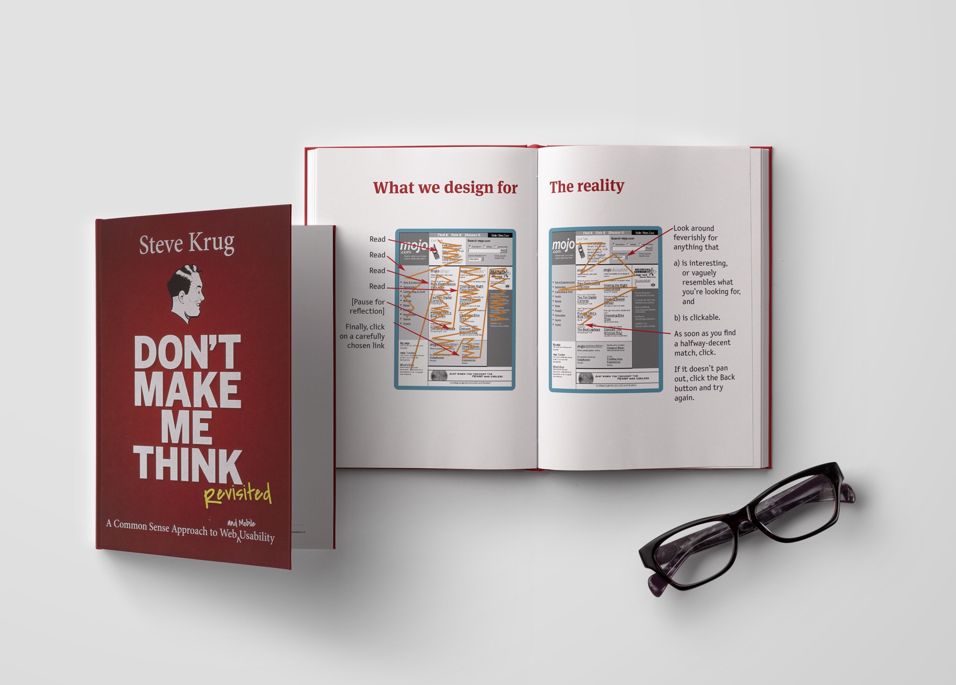
While modern web design looks much cleaner than the example above, it also carries forward many of the same issues. We’ve gotten better at hiding interface elements and traded in rigid tables for responsive grids, but still, ultimately prioritize designing web pages for information density rather than impact.
Much of this is due to the process by which web pages are typically designed: brainstormed as a series of slots for final content to fill in the future, with only a vague idea of what that content will look like. When you know you need to communicate to users about topics A, B and C, it seems obvious to separate the page into sections A, B and C — but what’s obvious isn’t necessarily what’s best.
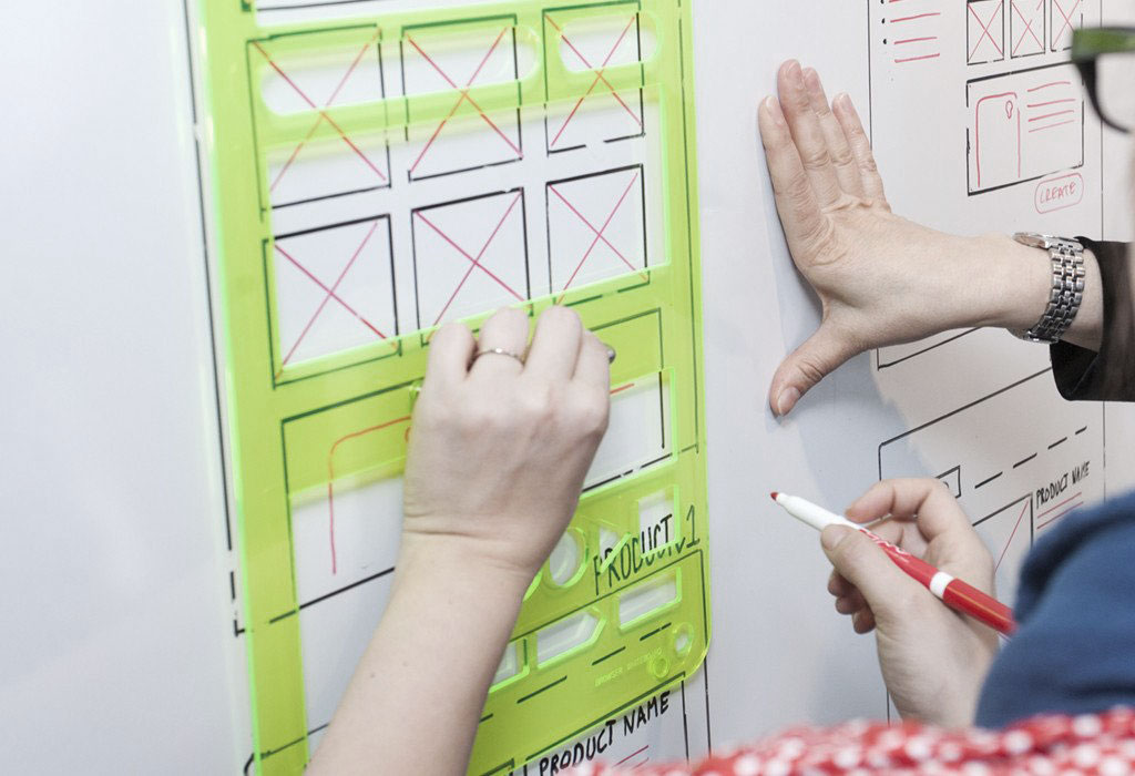
That’s why we finalize copy as much as possible before moving onto design, experimenting with different approaches in text before laying out the page. Earlier drafts of our new homepage copy were longer and more sectioned in structure, with the decision to cut it drastically down coming late in the process — a decision that would have been much more painful to make had we locked ourselves into a template beforehand.
With the copy locked down, we set our sights on designing the homepage to encourage thoughtful comprehension over swift skimming. The fundamentals we settled on:
Present one element at a time
The more elements there are visible on-screen, the more work the user has to do in figuring out which ones are relevant, resulting in them skimming the page as quickly as possible before really taking any of it in. Our approach was to limit the content to only what’s relevant, and give each element space to breathe without overlapping with others.
Use animations to draw the reader forward
Animations can make pages and applications feel more polished, but overdoing them can end up distracting users rather than guiding them forward. We chose to only animate elements that we want users to interact with next and to fade in each paragraph individually, so that they catch the eye while skimming and are easier to read.
Avoid heavy shapes and bold colors
To keep the focus on the message, we opted for large, light type on nearly-black backgrounds, and avoided having visual elements that would compete with the text for attention. Where we did opt for illustration and color, we keep things light with line-work and outlined shapes in soft, glowy hues inspired by the tech we love.
One area where you can see these fundamentals of focus come together is at the bottom of the homepage. While it’s common today to hide site navigation by default to retain focus on the content, the tradeoff in doing so is that the navigation becomes less discoverable, and consequently, your site becomes slightly more complicated to explore.
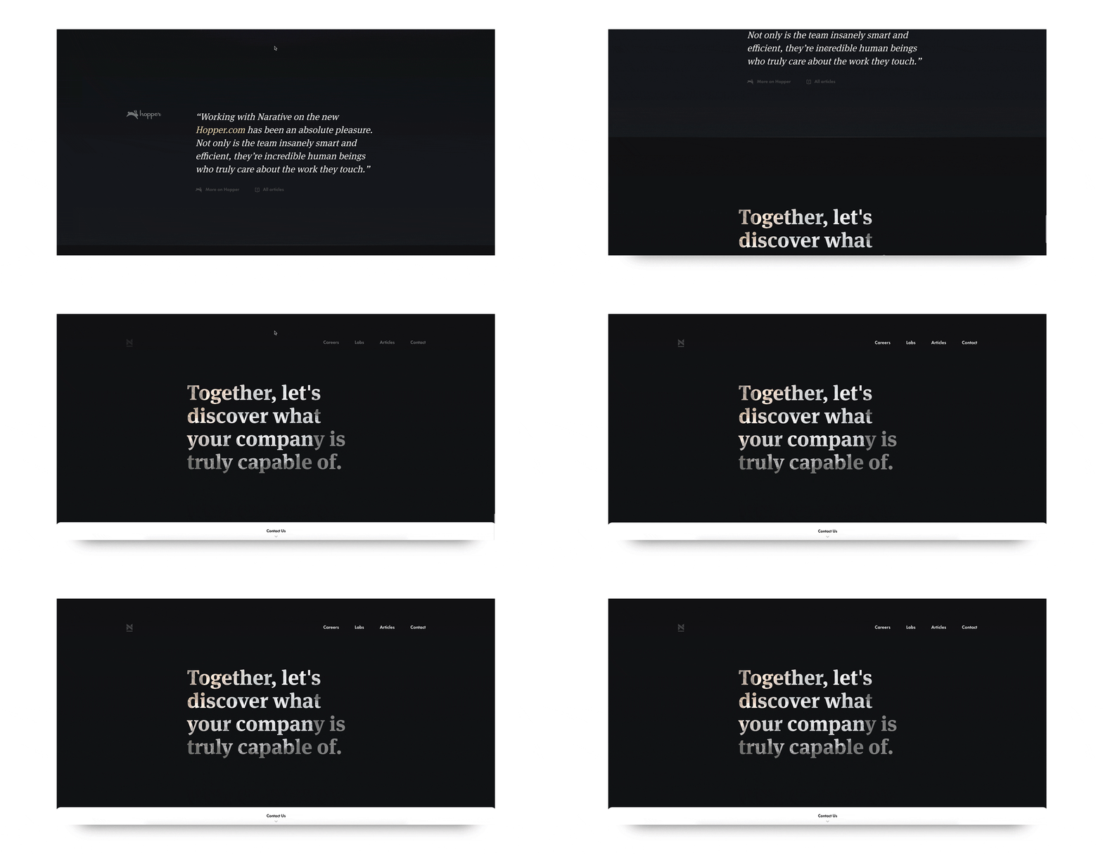
We chose in the end to make that tradeoff, but not without considering the best path for users to take through Narative.co. When someone first lands on our homepage, we don’t want them to immediately start exploring; we want to set the context by helping them understand who we are first. Once the user hits the bottom of the page, the full menu appears at the top of the screen to show users the full breadth of our site and invite them to explore more.
Show, don’t tell
We don’t use the word design anywhere in our homepage copy. The same goes for development, engineering and copywriting, too. Nonetheless, these are all obviously pretty important parts of what we do. So what gives?
Simply put, those are inputs, not outcomes. We want visitors to get excited about the potential of partnering with us, and that excitement isn’t going to come from reading an extensive list of every discipline under our belt. Plus, some things are better conveyed without words.
It’s a waste of our readers’ time for us to talk about how great we are at designing and building things while they’re interacting with something we’ve designed and built. We have the opportunity to show them first-hand.
At the same time, we wanted to keep the focus on the potential, and avoid encouraging preconceived notions of what those outcomes might look like. One of the reasons we keep our color palette constrained and visuals abstract is to avoid projecting a “house style” onto all of the work that we do. We adapt our approach to the needs of our clients and their own customers, and being too aggressive with our own branding could overwhelm that.
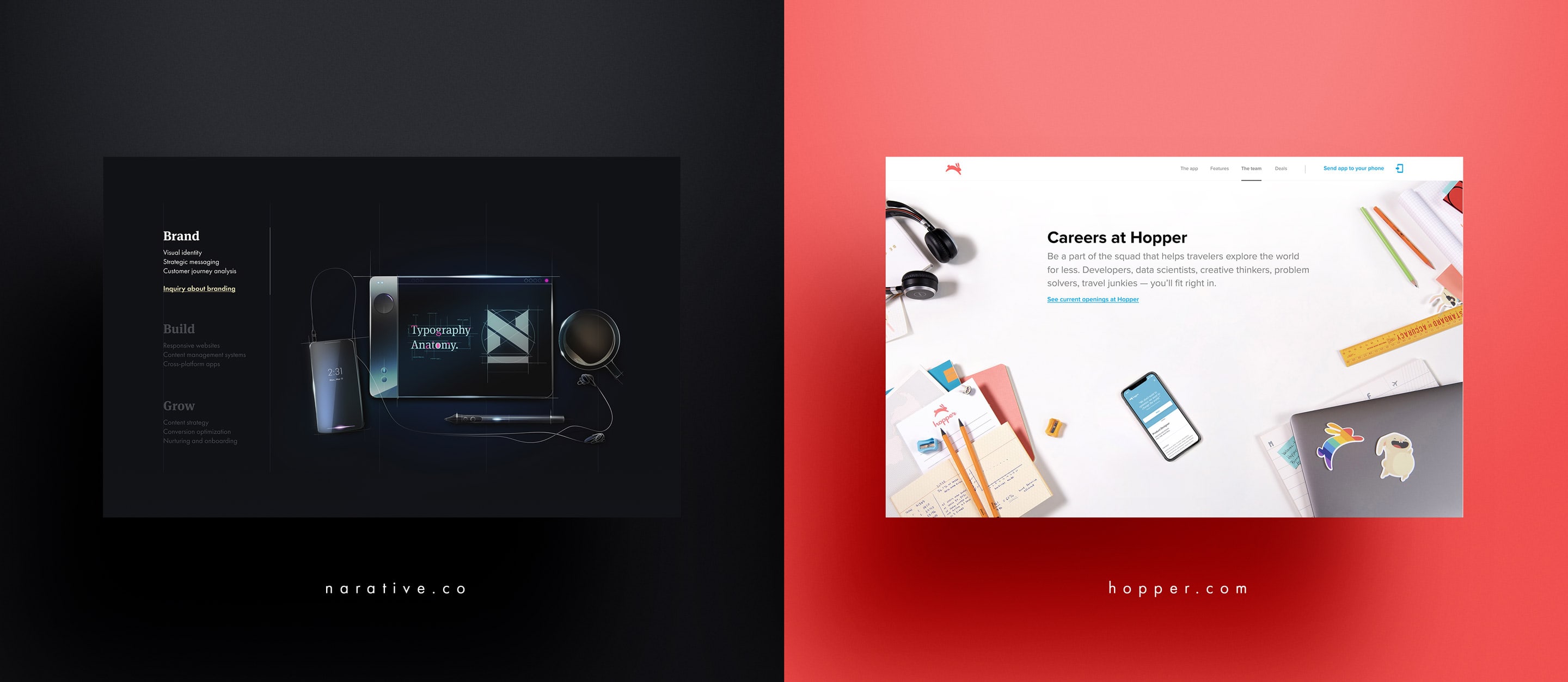
In exploring how to express our studio’s approach in both inspiring and abstract ways, we ourselves looked for inspiration in the tools that we use every day.
When users first land on the new Narative.co on a desktop browser, they’re greeted by a brief description of who we are and how we can help, and then invited to manipulate the artwork on the page itself — to participate with us in the digital creative process.
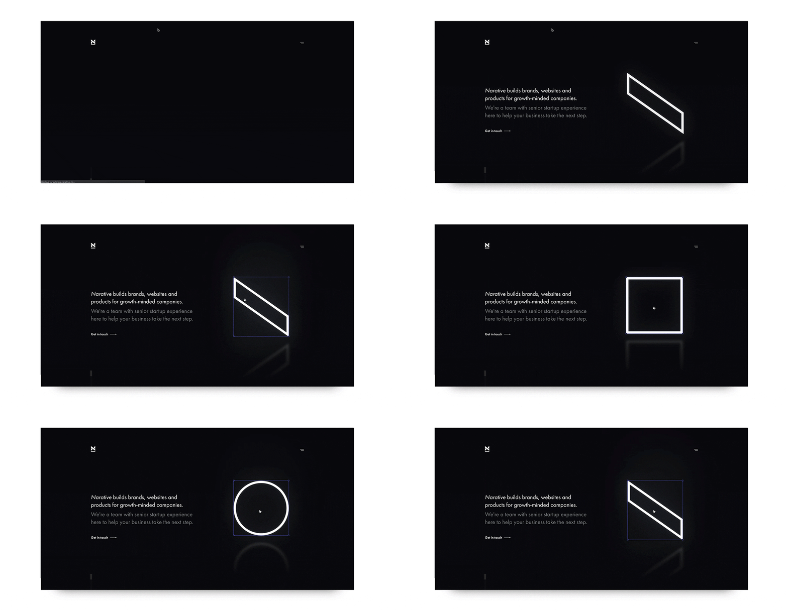
Clicking the shape will transform it between a circle, a square and a backslash shape lifted straight from our logo. Dragging the corners will resize it, with a pixel count updating in real time. Want to drag a big square all over our precious copy? Go ahead. It’s your square now.
We experimented with more complex shapes and animations that were pretty, but not nearly as fun or memorable as something you could play with yourself. This implementation was heavily inspired by Figma, a web-based design tool that allows an unlimited number of people to collaborate on a design in real time, and a tool which has been transformative to how we collaborate as a team.
Of course, large displays and precise cursor control are the domain of desktops, not mobile devices, which is why we opted to limit this interactive version to desktop devices only. On mobile devices, where screen real estate and user patience are both significantly tightened, we keep the focus mostly on the copy. But there are other visuals on display that users across all devices to see.
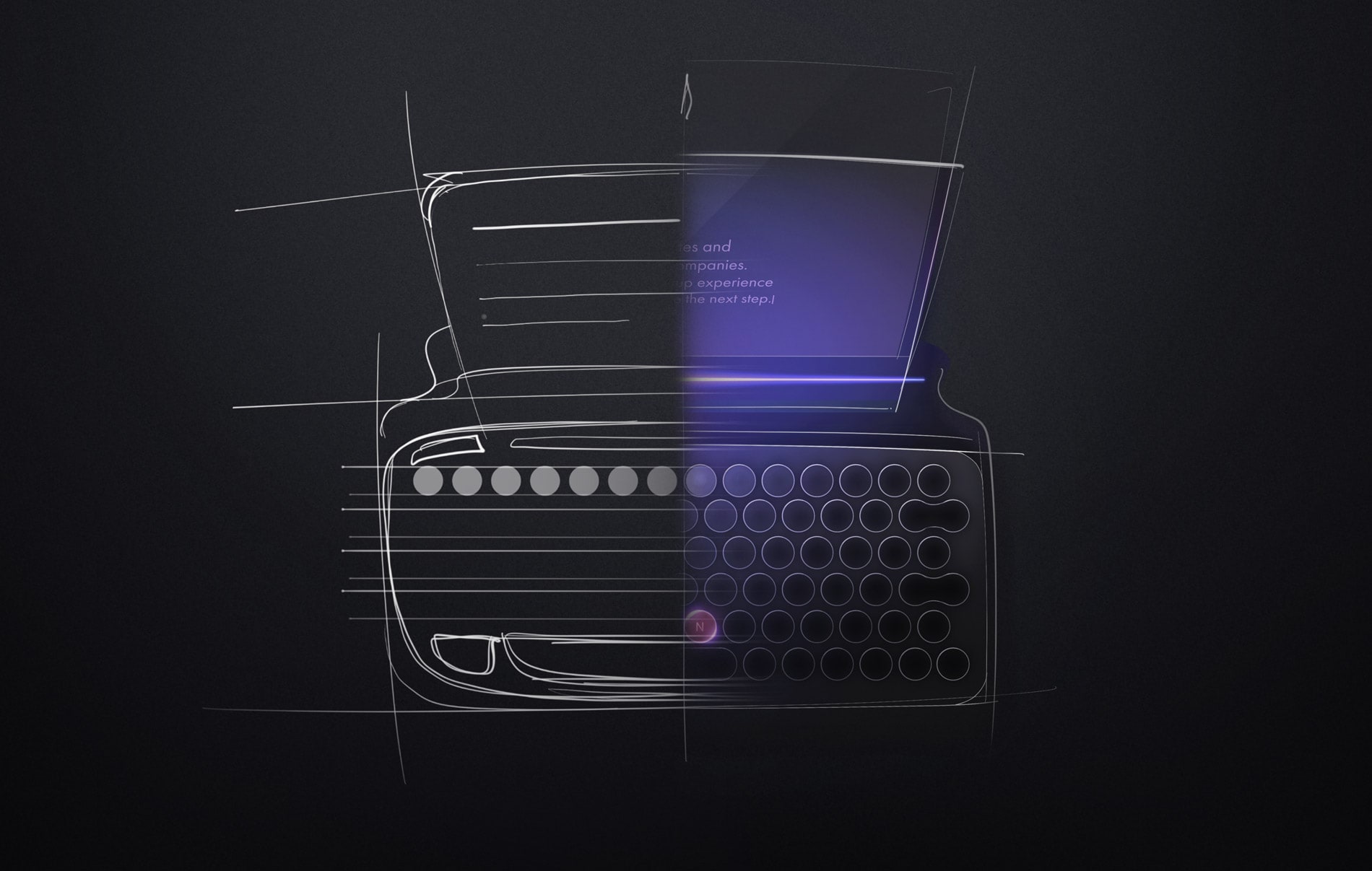
In keeping with the theme of creativity, we collaborated with industrial designer Mohammed Fazil to create artwork for our homepage and the hero sections across our website. Faz’s futuristic takes on familiar products had previously caught our eye, with repeated sketch lines revealing glimpses of the creative and iterative process behind each piece.
The result of that collaboration is a beautiful series of illustrations across our site representing both the process and outcomes of creative thinking, from the everyday objects that help us do our work, to icons of invention like the lightbulb, typewriter and smartphone reimagined through a futuristic lens.
The desire to let visitors immediately experience our work first-hand was also one of the driving factors in us deciding to build our own on-site articles section (which you are currently reading this post on), and move our existing content from Medium onto our site.
Content management systems are one of the most common types of projects that people ask us about, and so we saw this as a great opportunity to help inspire on the potential of collaborating with us. But there were also other factors in our decision to move away from Medium:
Control over the presentation of our content
The Medium aesthetic has become synonymous with writing about business and tech, but that aesthetic can be extremely limiting. If we’re writing about the work we do at Narative, it makes sense to present that content in a way that we feel is representative of that work; Medium’s limited formatting tools and homogenous looks just don’t allow us to do that.
One thing we did keep from Medium to align was defaulting to a white background on articles only, to delineate them from the rest of our site and to align with user expectations on what an “article” might look like — but as dyed-in-the-wool dark mode fans ourselves, you can bet we’ve kept dark mode just a quick click away.
Rethinking our content strategy for the long term
Medium makes it extremely easy to publish and distribute content, which is one of the reasons it’s so popular. But publishing on any third-party service means that we ultimately don’t own where our content lives, and Medium itself is prone to radical shifts in business model. While their renewed focus on paid subscriptions and editorial content could be great news for independent writers, that isn’t us. To improve our rankings in search results and to build long-term relationships with our audience, hosting our own content is necessary.
Encourage exploration across Narative.co
We’ve kept our marketing copy to a minimum, but that doesn’t mean we don’t have plenty to say. Hosting our content on Medium makes it impossible to integrate that content into other parts of our site; worse, it forces us to send users away from our site in order to read it, where we lose control of the experience. Keeping our content on Narative.co encourages users to continue navigating within our website to learn about and experience more of what we do.
What’s behind the curtain
Encouraging users to explore our site to experience more of our work and perspective first-hand would be pointless if it didn’t feel good to explore. And for this strategy to be viable, we need the freedom to continuously add new content to the website without making significant work for ourselves each time.
There are three core tools in our tech stack that help make all this possible:
Contentful is a “headless” content management system; in the simplest terms, it stores all of your content like text and media. But it doesn’t contain any styling or themes like WordPress or many other CMSs do; Contentful treats your content as just content, so you can send it to any page or channel, and use it with any framework. It’s simple enough to use that those in even the least technical roles can feel comfortable updating content by themselves. And because the data isn’t tied to any actual sites or applications, we can easily move CMSs later if we need to.
Gatsby is a web framework that makes websites quick to deploy and even quicker to click around. Gatsby only loads the most critical code necessary to render the page, and then pre-loads following pages as soon as it detects a user is about to click on them, delivering a speedy browsing experience for the user. Gatsby is based on React, a Javascript library for building application interfaces that our team has deep experience building web apps with; among all those other benefits, Gatsby allows us to leverage that experience in building static websites.
Netlify deploys any changes to our site as soon as we make them, whether those changes are in our repository or Contentful. And its integration with Contentful means that if something goes wrong while publishing, anyone can see what went wrong.
Beyond the individual advantages of these tools, their true benefit is in how seamlessly they work together. Contentful makes it easy to manage and create content; Gatsby lets us pull content from any data source and present it however we want; and Netlify makes sure that content always gets to the user, and fast.
All of these tools prioritize speed. But there are some other tricks we pull to make the site feel even faster, especially for users navigating on mobile devices, where speed — and the perception of it — are even more paramount.
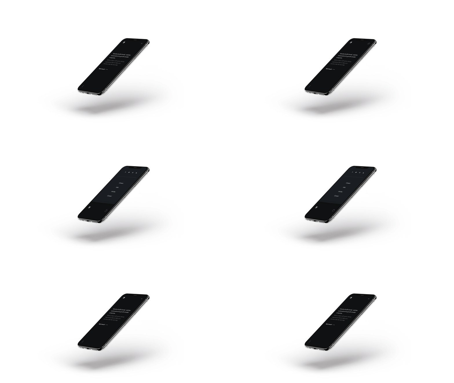
When the user toggles the navigation open, the current page content slides down to reveal the menu. The primary menu options are located within the easiest-to-reach section of the screen, with social media links — a lower priority for us here — kept further up.
The user can close the menu either by pressing the menu toggle again, or more likely, by simply tapping or, more likely, by simply swiping up on the content that is still in view at the bottom of the screen. We keep this content in view to make it easy to toggle back to it, to remind the user where they already are and to create a sense of space within the site.
When the user selects a menu option, we mask the content from the previous page, close the navigation and then load the new page in. This feels like a more native experience on mobile devices, and makes the transition between pages feel seamless.
Navigation is just one area of the site where we take advantage of animations to make the experience feel faster and more familiar to the device the user is browsing from. While the content and design of the site are nearly identical across all devices, the way it feels to interact with can greatly differ — as it should.
One step forward, many steps ahead
Launching the new Narative.co means much to our business today. It’s the clearest expression yet of the impact we create for the partners we work with, and the values that matter to us both as creative professionals and as a team building this business together.
But it will mean much, much more for us in the days and months ahead. We’ll continue to iterate on the content, design and functionality of our site over time, and share the results of that work here with you. And the ease of making changes and publishing new content on Narative.co makes it easier than ever for us to do both.
We open up as much of our work as possible to the design and technology communities, and we can’t wait to share more soon. If you enjoyed this piece, we hope you’ll follow us on Twitter and stay in touch.