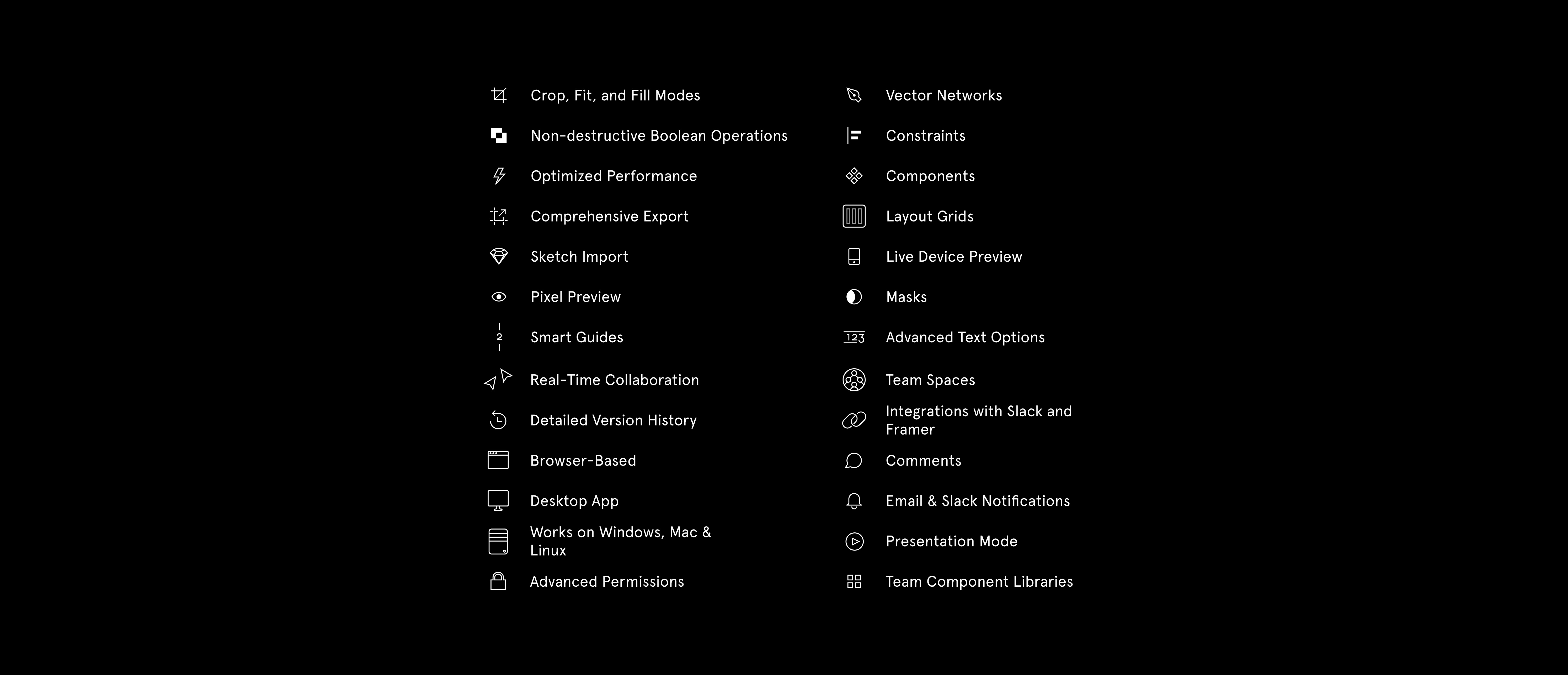
To understand why Figma is the best design tool for our company, you have to understand what we do. As a designer, I’ve been crafting digital experiences for the past ten years, having contributed to the growth of companies such as Hopper, Lightspeed, and Breather, among others. Throughout this journey, I’ve had the opportunity to meet the most talented designers, engineers, growth marketers, and build a world-class team to develop startups worldwide. We call this team Narative.
Narative is a studio based in 3 different cities around the world; so right off the bat we’re already facing a challenge; geography.

We came across Figma a few weeks before engaging in our first project. It’s worth noting that, I’ve been using Sketch for several years before Narative, and getting out of your comfort zone can be scary.
Just thinking about re-learning a new tool, transferring past designs, plugins and projects I’ve been working on for years, started to give me anxiety.
Luckily, the transition was more than natural. Working on Figma was second-nature and, two weeks in, it became my daily driver. In three weeks, I became a fan, and today I am probably an advocate. Here are eight reasons why.
Easy migration
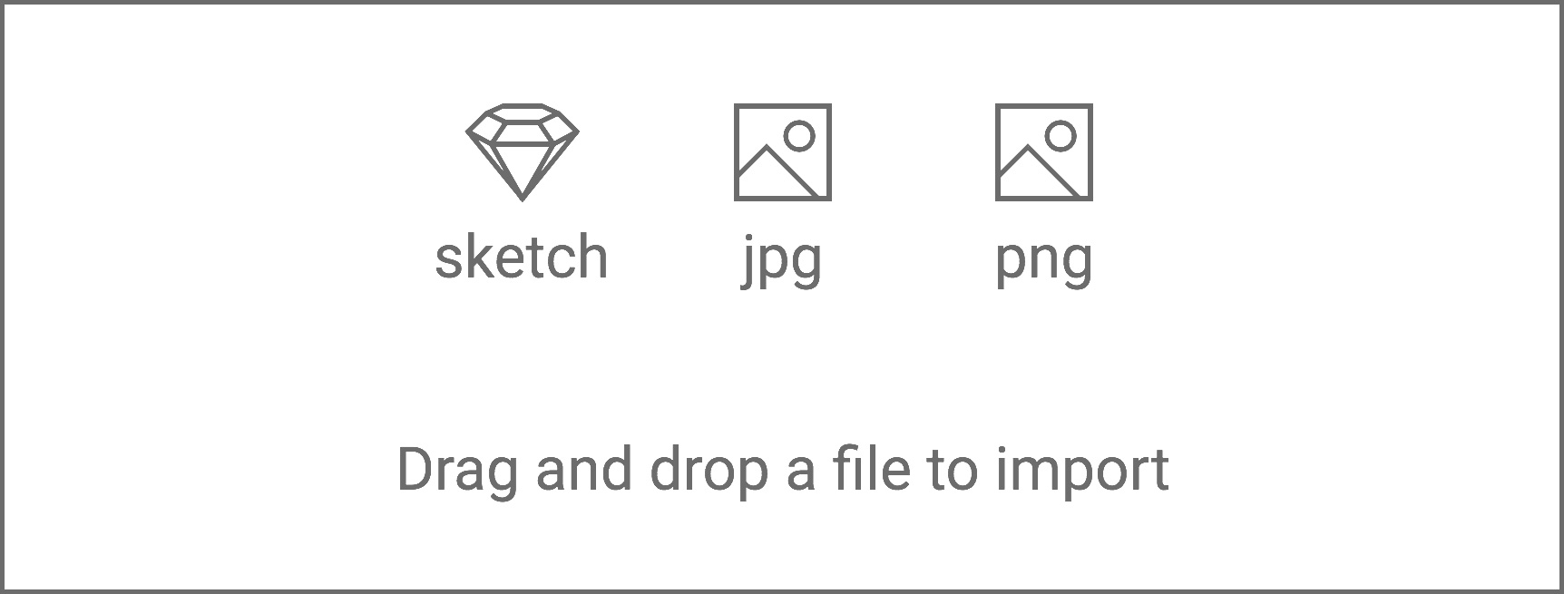
Not much to say here. You literally just have to copy your art-boards — or as they call it, frames — then paste them into Figma. Simple as that. The platform is very forgiving and prepared for transitions.
Zero file management
What does that mean? Sketch, Framer, Adobe XD or even Photoshop are native apps where you inherently need to save your work. Some tools have auto-save, of course, but you still end up with hundreds of megabytes and even gigabytes on your drive. And yes, if you lose your disk, break your computer somehow, or have your dog eat your SSD, you will lose your files completely.
Not with Figma. Not having to command+s is a big deal. Figma is a web-based software, meaning you never need to upload, download, or worry about versions again. Imagine a Google Docs for design, keeping all my projects organized in one app, in the cloud. One single source of truth for design files.
I probably saved more than 30GB of disk space by migrating my projects to Figma, and now I can access them from anywhere.
Figma is platform-agnostic
One of the best features of a web-based software is the fact you’re no longer stuck with an operating system. You can run it right from the browser or from their native app, that’s essentially a wrapper. I’m able to seamlessly start a project on my iMac Pro at my home office, and continue on my Surface Book 2 on the go. That’s huge.
Additionally, you’ll always have the latest version, with no need to download painful software updates. The “cloud” is finally making sense in 2018.

Performance
You may be thinking that running a full-fledged design app from the web has huge performance drawbacks. I thought the same, but was I ever wrong.
I’ve always had full-spec computers running Sketch, still, ever so often I’d run into performance hiccups or memory drainage. That’s never happened with Figma, which is pretty magical.
I continually forget that I’m running a huge project in a “webpage”, and as soon as I remember, it always blows my mind because of how fast it is.
Components and styles
This is a feature that most product design tools have, but for some reason, it’s slightly more polished on Figma.
At Narative, as we constantly change projects, styles and teams, one of the best ways for us to keep in sync is by publishing components. Even in different projects, or “files”, we can load components and libraries from previous projects, allowing us to be extremely efficient and consistent.
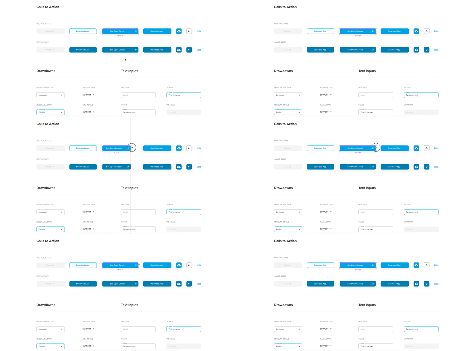
Building components such as buttons, modals, and form fields is awesome. Say you build 30 pages using one single library of components, and if you ever decide to update the style of a button from this library, for example, you simply update the master and, voilà — all 30 pages will have the brand new and updated button.
Our engineers love it
From an engineering perspective, it’s extremely efficient having our projects centralized in one platform. In the past, every time I updated a project, I had to manually sync my designs through a plugin into a third-party “inspection” platform where engineers would have access to. Although this method works, it’s not ideal in a fast-paced project development.
With Figma, engineers see changes in real time, allowing them to participate in every step of the project, from wireframes to design.
Design Programmatically is key for us, so our engineers can simultaneously work on developing components while us, designers, progress with the design creation and copywriters progress with content. We essentially have all of the tools we need to create dynamic, digital products in one place.
Tabs!
One of my favourite features, and probably something I took for granted in the past is the ability to open projects in tabs.

Like a browser, the Figma app allows you to have several tabs open so you can jump back and forth between pages rather than having multiple windows messing up your desktop. I probably increased my efficiency by 50% or more being able to have several projects open, without eating my RAM alive.
Power to our team
Back to my initial point, collaboration is key for a company like Narative. Especially with a team overseas. Working on Figma, however, regardless of where you are in the world, it’s like working right next to each other.
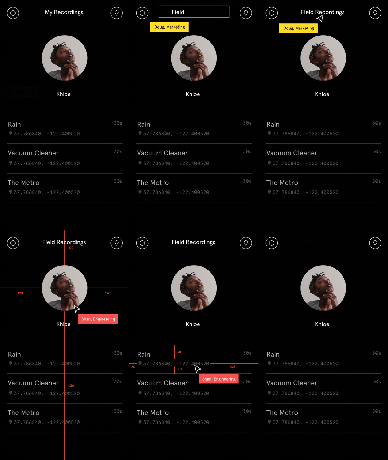
It’s tough to express just how efficient we’ve become, with everyone having access to one single file, at the same time.
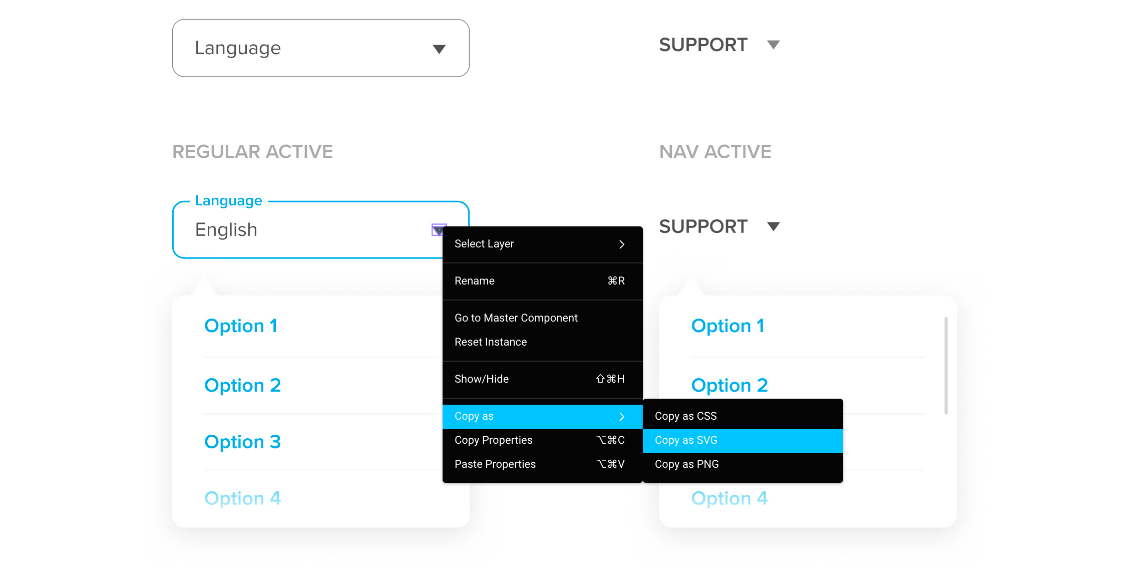
I design simultaneously with our copywriter, while our developer watches our progress, providing relevant comments. Again, it’s magical. Exporting images, SVGs, colors, and even CSS styles, is as simple as right-clicking and copying.
Conclusion
Figma is not only a full-fledged design tool but the best I’ve used in years. It speaks volumes regarding just how much its creators considered the future.
Witnessing forward-thinking products is not only refreshing but extremely inspirational to know there are teams working hard to support companies such as Narative to succeed. From drafting our first ideas to real prototypes, all while reducing the friction of turning visual concepts into code.
If you're still not sure, you should definitely try it out. It's free.
